Effective website navigation is important for two primary reasons. Firstly, it significantly influences user experience, enhancing the likelihood of conversions by helping audiences find what they seek.
Secondly, it plays an important role in supporting search engines. A well-organized navigation structure assists search engines in understanding the layout of your site.
Now, the question arises: How can you enhance navigation to assist audiences in finding their desired information and boost your website’s SEO performance?
In this post, we’ll discuss the best practices for website navigation. So, without any further ado, let’s get started.
Table Of Contents
1 What is Website Navigation?
Website navigation refers to the structure and design elements that facilitate your audience to move around and interact with your website.
It includes the various menus, links, and other navigational tools that guide the audience through the content and features of a site.
Effective website navigation is necessary for a hassle-free user experience, ensuring they can easily locate information, products, or services.
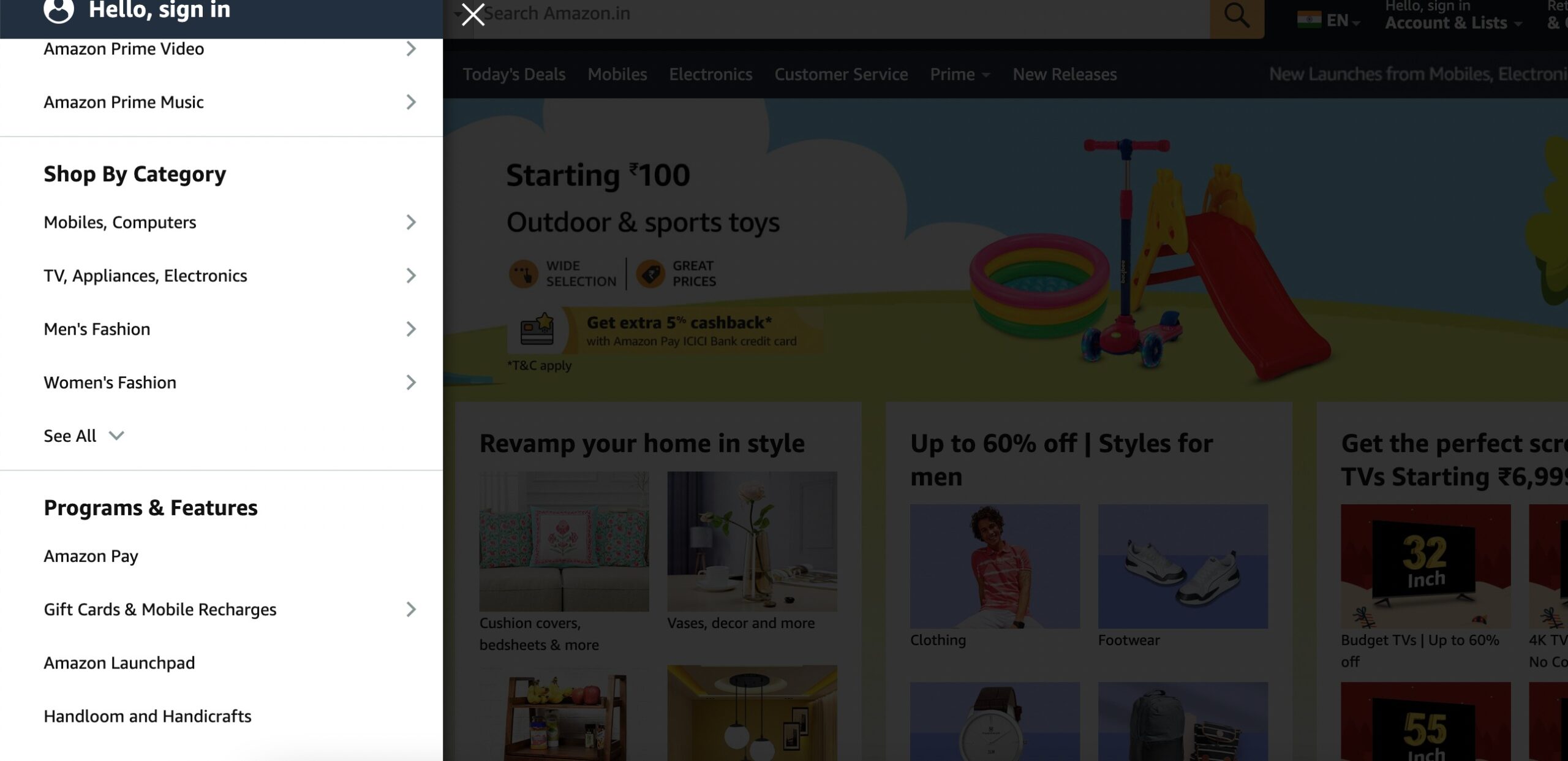
Consider an online retail website like Amazon. The homepage features a prominent menu bar offering categories like Electronics, Books, and Clothing. Visitors can further navigate through subcategories within each category or use the search bar for specific products. Additionally, product pages include clear calls-to-action (CTAs) like Add to Cart for appropriate navigation through the shopping process.
2 Importance of Website Navigation
Search engines, such as Google, assess the content quality and overall user experience when determining a website’s relevance to the audience queries.
A well-structured and intuitive navigation system enhances the user experience by allowing visitors to discover and access relevant information easily. This, in turn, leads to lower bounce rates and increased user engagement, signaling to search engines that the site is valuable and user-friendly.
Additionally, effective website navigation contributes to the proper indexing of content by search engine crawlers. When the navigation is clear and logically organized, search engines can more efficiently crawl and index the pages, understanding the hierarchy and relationships between different sections of the site.
3 Common Website Navigation Components
Let us discuss the common navigation components to help you build your website.
3.1 Navigation Menus
Navigation menus are essential components of web design, providing a structured way for audiences to access different sections of a website.
They can be horizontal or vertical and typically appear at the top or sides of a webpage.
For example, a horizontal menu on an e-commerce site may include categories like Electronics or Clothing, guiding the audience to specific product pages.

3.2 Dropdown Menus
Dropdown menus are another popular navigation element that enhances website usability by providing a compact and organized display of options.
When you hover or click on a specific menu item, a dropdown reveals additional choices.
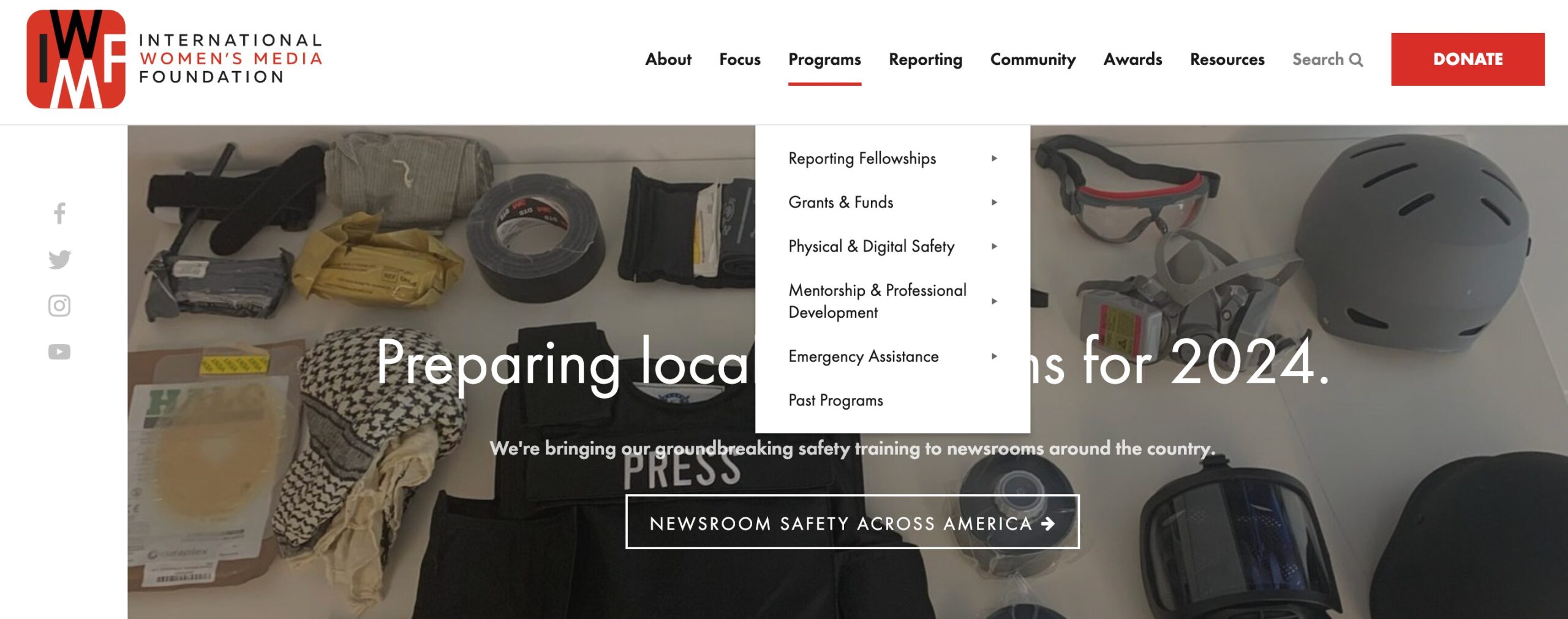
These menus optimize space, reduce clutter, and contribute to a more user-friendly browsing experience.
3.3 Hamburger Menus
Hamburger menus are prevalent navigation elements identified by three horizontal lines resembling a hamburger icon.
Typically found in the top corner of a website or app, clicking on the icon reveals a hidden menu. For instance, on mobile websites, the hamburger menu condenses navigation options to save screen space.
Selecting the icon may expand options like About Us, and Contact.
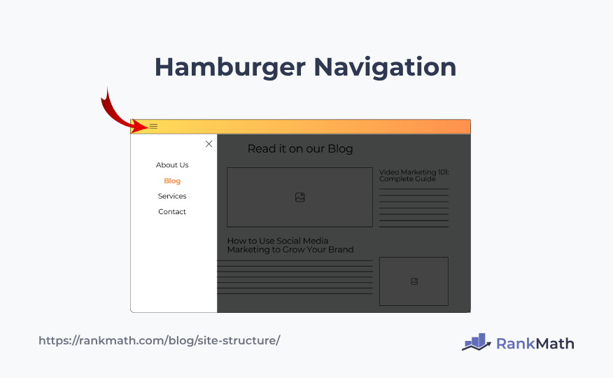
Hamburger menus streamline navigation, especially on smaller screens, providing a clean and unobtrusive design while maintaining accessibility to essential content.
3.4 Tabbed Navigation
Tabbed navigation is a common design element that organizes content into separate tabs, enabling you to switch between different sections without leaving the page.
For instance, on a news website, tabs might represent categories like Politics, Sports, and Entertainment. Clicking on each tab displays relevant content while keeping the layout clean and user-friendly.

3.5 Accordion Navigation
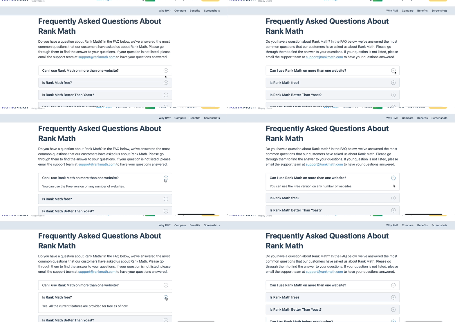
Accordion navigation is a design element that conserves space by presenting information in a collapsible and expandable format. Typically, a list of items is displayed, and clicking on an item expands its content while collapsing others.
For instance, each question can be a header on a FAQ page, and clicking on it reveals the corresponding answer, minimizing clutter.
4 Best Practices for Website Navigation
Let us now discuss the best practices for website navigation.
4.1 Create a Logical Hierarchy
A clear and well-organized hierarchy ensures the audience can easily understand the relationships between sections and pages on your website.
By prioritizing information in a logical manner, from broader categories to more specific subcategories, audiences can navigate easily, reducing confusion and enhancing their overall experience.
Logical hierarchy helps your audience find what they’re looking for and also assists search engines in understanding the structure and importance of content on the site, consequently positively impacting SEO.
4.2 Use Descriptive Navigation Labels
Using descriptive navigation labels is an important aspect of website navigation that involves providing clear and concise labels for menu items and links.
Descriptive labels help audiences understand the content they can expect to find when clicking on a particular link, contributing to a more intuitive and user-friendly experience.
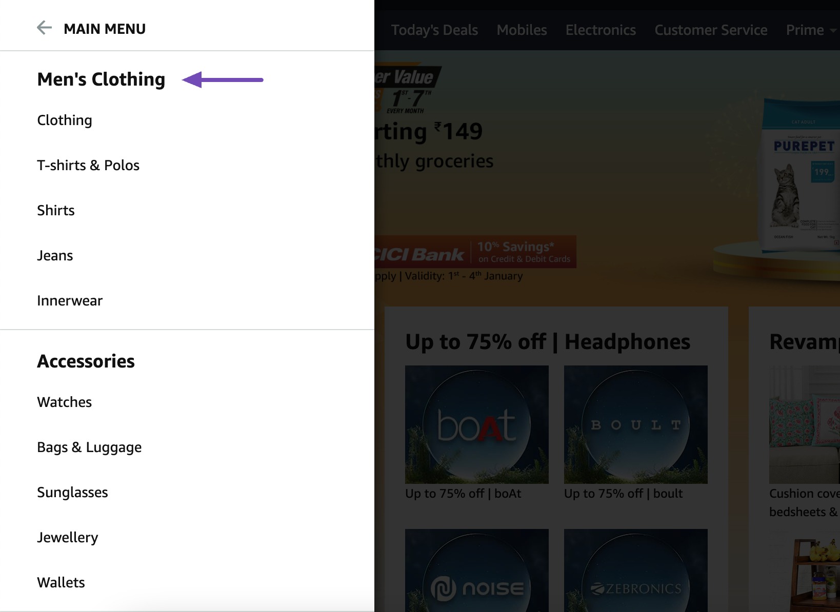
For example, instead of a generic label like Products, a more descriptive label such as Men’s Clothing and Women’s Clothing provides the audience with a clear understanding of the content behind the link.
4.3 Maintain Consistency Across All Pages
Maintaining a consistent menu structure across a website’s pages is important for user-friendly navigation. A consistent layout helps your audience become familiar with the site’s structure, facilitating easy navigation between pages.
When menu items and labels remain uniform, your audience doesn’t have to reacquaint themselves with the navigation system when exploring different sections.
This cultivates a sense of reliability, promoting user engagement with the website. Moreover, from an SEO standpoint, a consistent menu structure assists search engine crawlers in efficiently indexing and comprehending the site’s content, thereby enhancing overall rankings.
4.4 Include Breadcrumbs
Next, implement breadcrumb navigation on each page. Breadcrumbs typically appear near the top of the webpage and display the audience’s journey from the homepage to the current page.
For instance, if you’re viewing a specific product like Sports Shoes > Men’s Collection, the breadcrumb trail would read Home > Footwear > Sports Shoes > Mens Sport Shoes.
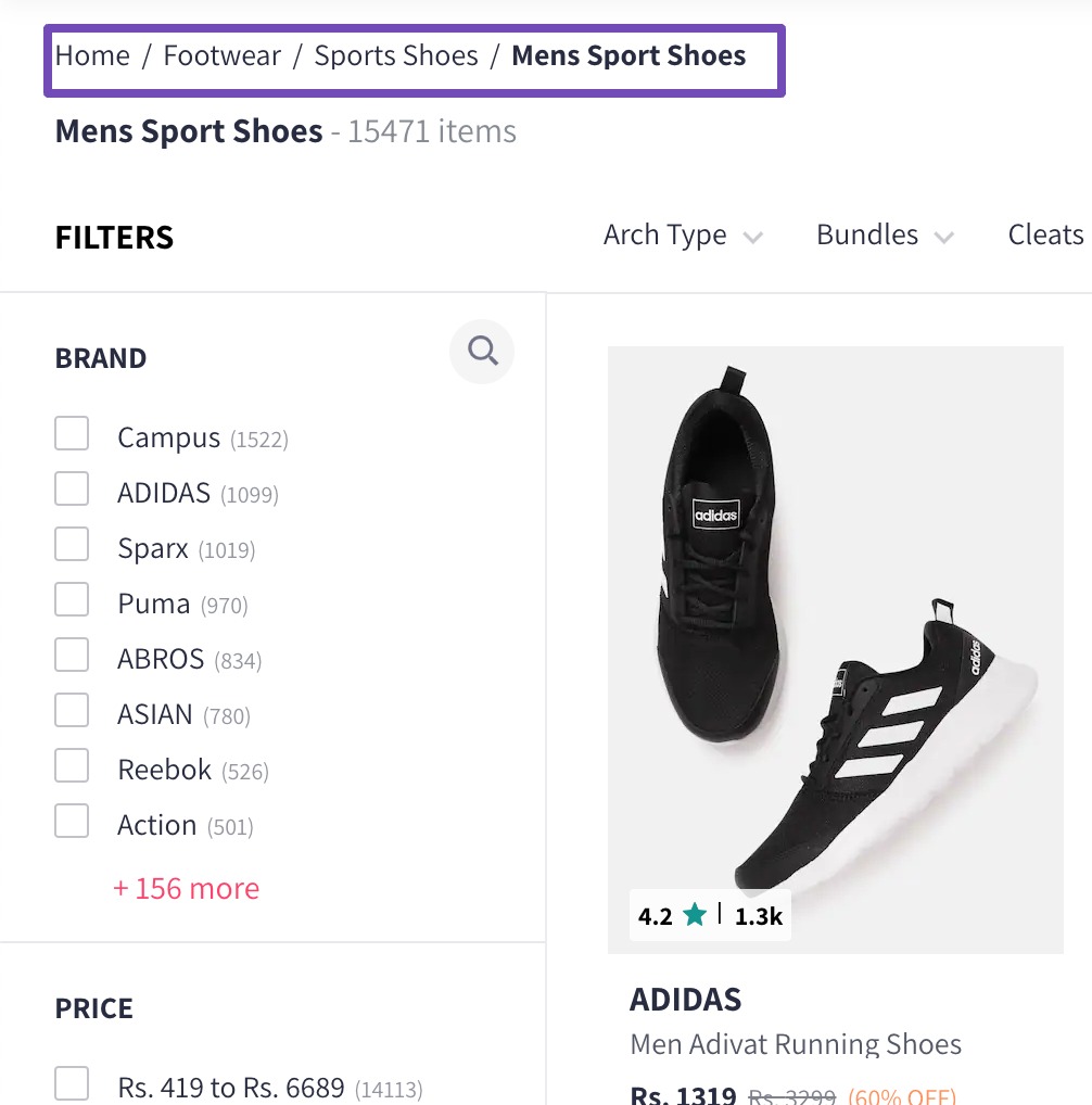
Each segment in the trail should be clickable, allowing you to navigate back to any level in the hierarchy easily.
Rank Math makes it very easy to add breadcrumbs to your website. Refer to our video on enabling breadcrumbs on your site.

4.5 Cross-Link Relevant Pages
Cross-linking relevant pages involves creating hyperlinks between different pages on a website that share related content.
For instance, on an e-commerce site, a product page for Running Shoes can be cross-linked to pages on Athletic Socks or Running Gear, guiding audiences to complementary products.
Descriptive anchor text, such as Explore our collection of Athletic Socks, ensures clarity and improves search engine understanding.
Strategic cross-linking not only benefits user experience but also strengthens internal linking for SEO, potentially boosting the visibility of key pages in search results.
4.6 Don’t Hide Navigation
Hiding navigation elements, particularly on desktop or mobile interfaces, can lead to confusion and frustration for your audience trying to navigate a site.
Visible navigation menus, whether in the form of a traditional menu bar or a hamburger icon on mobile devices, provide the audience with a clear pathway to explore different sections of a website.
When navigation is hidden, your audience may struggle to find essential information, leading to increased bounce rates and a negative impact on user satisfaction. Visible navigation ensures the audience can access various pages quickly and intuitively, contributing to a more user-friendly and efficient browsing experience.
4.7 Create User-Friendly Mobile Navigation
User-friendly mobile menus are an important component of responsive web design, ensuring a smooth and intuitive navigation experience for users on smaller screens.
The key to user-friendly mobile navigation lies in its adaptability to various screen sizes and the prioritization of clear, concise navigation options.
Employing the widely recognized hamburger icon—a set of three horizontal lines—facilitates a clean and uncluttered mobile interface.
Consideration for collapsible submenus prevents overwhelming the audience with information, allowing for a streamlined and organized mobile menu.
5 Conclusion
Implementing effective website navigation is not just about creating a good user experience but is fundamental to successful SEO practices.
A well-thought-out navigation structure enhances user satisfaction, reduces bounce rates, and encourages prolonged engagement with the content.
Simultaneously, search engines rely on intuitive navigation to crawl and index a website efficiently, influencing its visibility and ranking in search results.
By prioritizing logical hierarchy, using descriptive labels, and ensuring consistency across pages, websites can significantly enhance user experience and SEO performance.
Which practices do you follow for website navigation? Let us know by Tweeting @rankmathseo.
